Problem
Most burndown charts look like this:
However, teams frequently don’t actually burn down this steadily. Often team members
know on planning day that they will be gone for half a day for a dentist appointment,
taking a three day weekend, or are going on a vacation that takes up half their
capacity for the first half of the iteration.
This causes the traditional straight line burndown chart to potentially tell the wrong story. It could give the appearance the the team is way behind, when the team actually has most of their available capacity at the end of the iteration. Or worse, the burndown chart shows that the team is on track, or even ahead, when they are actually in serious danger of not hitting their commitment because half the team will be gone on the last two days for a conference.
It is important for information radiators to communicate as much accurate information as precisely and obviously as possible. It’s all to easy to make the assumption that the team is perfectly on track, and the conversation about what will actually get done never happens. To help prevent stakeholders from being mislead, we recommend trying a stair step burndown chart.
Ingredients
- 1 Blank burndown chart for however your iteration looks.
- 1 Ruler
- 1 Sharpie
- 1 Green marker
- 1 Red marker
Instructions
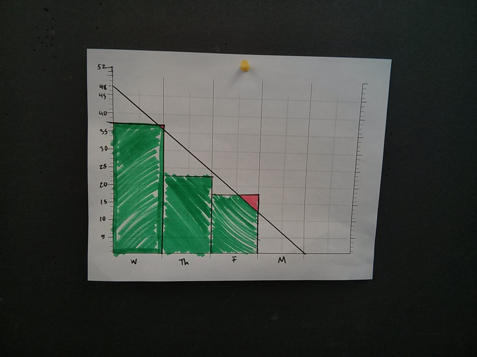
- Get the team’s capacity by day.
- Draw a horizontal line on each day of the sprint, indicating how much of the team’s capacity is left in the sprint.
- Label each horizontal line with the number of hours left. This makes it much easier to update the chart throughout the week.
What this does
Here is an example of a regular straight line burndown chart:
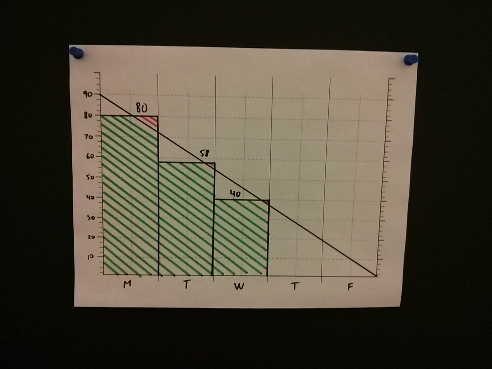
Eveything looks great, right? The team fell behind at first, but is starting to catch up and is now only an hour or two behind. It would be totally reasonable to for the team to believe that they will make up those two hours and should have little problem hitting their commitment.
One thing the team has forgotten though, is that two of their team members will be gone at a conference on Thursday and Friday. The stair step burndown tells a completely different story:
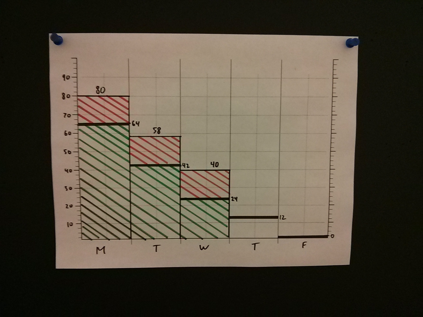
Now we see that the team is actually 16 hours behind, and the team only has 24 hours of capacity left in the entire sprint. This realization, while harsh, is much better to have on Wednesday, midway through the sprint, than on Friday afternoon. This way the team has the time to warn the Product Owner and figure out what needs to be removed from the sprint. The Product Owner is able to use that advance warning to plan for the following iteration, taking in to account that some of the work that was originally thought to be done this week is actually going to take up a sizable portion of next week as well.
In retrospect, this is a very minor adjustment to the existing burndown chart. There is something about burndown charts that allow you to omit tiny pieces of information and all of a sudden the same chart tells a completely different story. A burndown chart should not be a substitute for communication, but it should definitely be as obvious as possible. Anybody should be able to walk in, see it on the wall, and figure out what it is indicating, all without any Scrum or Agile experience.
Variations
You can get even more fine grained by stair stepping by half days. This can lead to some pretty interesting conversations about how morning capacity differs from that in the afternoon.